trunx

Super Saiyan React components, son of awesome Bulma
ToC
Installation
With npm do
npm install trunx
Of course you also need Bulma (v1) but it is up to you if you want to install it via bulma npm package. See how to install Bulma.
You may also have React installed, minimum version supported is 17 (the Trunx transpiled code uses react/jsx-runtime). However it is not listed as a peer dependency, you may also use Trunx without React (see for example how to use Trunx with Preact).
Finally I recommend using TypeScript to get the best developer experience with Trunx.
API
React components
Almost all Trunx components have a bulma prop that accepts:
- a string
- an array of bulma classes:
["button", "is-primary"] - an object which keys are bulma classes, when value is truthy then the class is added:
{ "is-primary": true } - an array of any of the previous:
["button", { "is-primary": true }]
You know, Trunx is a Super Sayan because it is written in TypeScript. The bulma prop can be autocompleted and typos can be avoided thanks to type checking.

HTML tag components
Some Trunx components render their homomnym HTML tag.
import { Div, Span } from "trunx"
export function MyComponent({ isSuccess }: { isSuccess: boolean }) {
  return (
    <Div bulma="box">
      <Span
        bulma={["has-text-weight-semibold", { "has-text-primary": isSuccess }]}
      >
        Lorem ipsum...
      </Span>
    </Div>
  )
}
Bulma related components
Trunx provides React components that implement a Bulma element or a Bulma component. This means that they usually add a related Bulma class. For example Button component renders a button HTML tag with the Bulma button class. They may have props related to some Bulma class (.e.g. color, size). Most of the Bulma related props start with is, has and the prop name is just the camel-case version of its related Bulma class. For example isRounded prop corresponds to is-rounded Bulma class.
<Button color="primary" size="large" isRounded>
  Download
</Button>
You can use the bulma prop in case you need to add more Bulma classes that has not a related prop.
<Columns isGapless>
  <Column bulma="is-half"></Column>
</Columns>
Inline documentation
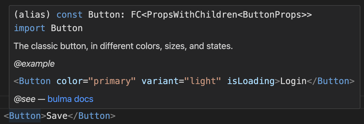
Components are documented inline with TSDocs. You can configure your editor to display documentation and examples.

Some code snippets use a FontAwesome class, for example <i className="fas fa-home"></i>. The icon set is up to you, Trunx do not provide icons.
className prop
Almost all trunx components support a className prop, in case you need to append your custom CSS classes.
Components list

HTML tags: A, Div, P, Span, Ul.
Bulma related:
Breadcrumb,BreadcrumbItemButton,ButtonsCardCardContentCardFooterCardHeaderCardHeaderIconCardHeaderTitleCardImage
CellCheckboxColumnColumnsContainerContentControlDeleteDropdownDropdownDividerDropdownItemDropdownMenuDropdownTrigger
FieldFieldHorizontalFieldBodyFieldLabel
FileUploadFileIconFileLabel
FixedGridFooterGridHelpHeroHeroBodyHeroFootHeroHead
Icon,IconTextImageInputLabelMediaMediaContentMediaLeftMediaRight
MenuMenuLabelMenuList
MessageModalModalBackgroundModalCardModalCloseModalContent
NavbarNavbarBrandNavbarBurgerNavbarDividerNavbarDropdownNavbarDropdownMenuNavbarEndNavbarItemNavbarLinkNavbarMenuNavbarStart
NotificationPaginationPaginationEllipsisPaginationLinkPaginationListPaginationNextPaginationPrevious
ProgressRadioSectionSkeletonLinesSelectTableTabs,TabTags,TagTextareaTitle,Subtitle
classnames
Trunx package provides a utility for conditionally joining CSS classes together.
Syntax is similar to classnames npm package.
import { classnames } from "trunx"
classnames("foo", "bar") // 'foo bar'
classnames("foo", ["bar"]) // 'foo bar'
classnames({ foo: true }, { bar: false }) // 'foo'
It accepts a generic “class names” type.
type T = "foo" | "bar" // my CSS classes
classnames<T>("foo", "quz") // ERROR: not assignable to type ClassnamesArg<T>[]
Notice that you can use Trunx without React! It can be used with any framework as well as with Web Components. The classnames.js is only 299 bytes and can be imported directly with
import { classnames } from "trunx/classnames"
The snippet above will avoid importing the React stuff.
Bulma type
Trunx exports also a Bulma type which is a literal type containing (almost) all the Bulma classes.
For example, you can use it to make sure a className is a bulma class:
import { Bulma } from "trunx"
export function SuccessText({ text }: { text: string }) {
  return <span className={"has-text-success" satisfies Bulma}>{text}</span>
}
How to
Use Trunx with Vite
Assuming you have a Vite project with React and TypeScript, of course first of all install trunx and bulma.
Then create a src/main.scss, you can import all Bulma to get started.
@use "bulma/sass";
Import it in your entry file, e.g. src/main.tsx, with something like import "./main.scss" and you are done.
Try it out! Import trunx in your src/App.tsx:
import { Message } from "trunx"
Add a Message like this in your JSX:
<Message color="primary">Hello Trunx</Message>
Create a custom component
Suppose you want to create your custom button that is always rounded and has only success and warning colors. You may also want to set your custom colors.
To do so, your src/main.scss could be something like this:
@use "bulma/sass" with (
  $success: #28a03c,
  $warning: #f45a50
);
Then your button component can import the ButtonProps from trunx and customize them,
something like the following.
import { PropsWithChildren } from "react"
import {
  Button as _Button,
  ButtonProps as _ButtonProps,
  ColorProp,
  MainColor,
} from "trunx"
type ButtonProps = Omit<_ButtonProps, "color" | "isRounded"> &
  ColorProp<Extract<MainColor, "warning" | "success">>
export function Button({ children, ...props }: PropsWithChildren<ButtonProps>) {
  return (
    <_Button isRounded {...props}>
      {children}
    </_Button>
  )
}
Use Trunx with Preact
Trunx is compatible with Preact. It is possible to alias react/jsx-runtime to Preact equivalent and Trunx will work out of the box. For instance if you are using esbuild, add these aliases to your build options
alias: {
  'react': 'preact/compat',
  'react-dom/test-utils': 'preact/test-utils',
  'react-dom': 'preact/compat',
  'react/jsx-runtime': 'preact/jsx-runtime',
}
See also on official Preact documentation how to alias React to Preact.
Motivation
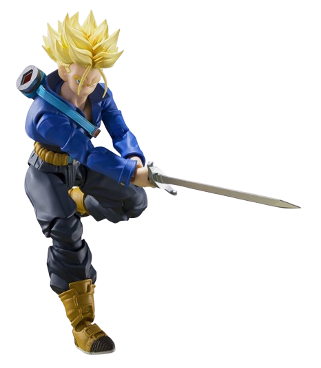
I really like Bulma CSS framework and I am also a Dragon Ball fan. That is why I am creating this component library. I hope you enjoy it!
Trunks (Japanese: トランクス Hepburn: Torankusu) is a fictional character in the Dragon Ball manga series created by Akira Toriyama.
I remember when I was reading the comics and Trunks arrived from the future. He was really powerful and could defeat Frieza in few seconds. One of the best twists of the entire series, in my opinion.